Publishing I - Project 1
Seoh Yi Zhen (0328497)
Publishing I: Print Media
Project 1 - Page Layout Design
Week 3
Week 4
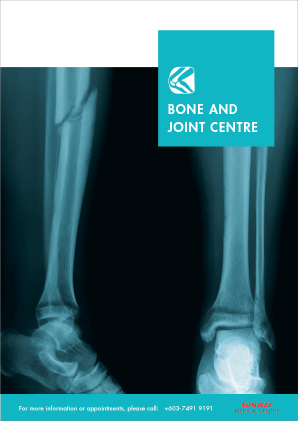
In this week's class, we had a critique session for everyone's progress so far. The comments that I received for my inserts were mainly about the design of the front pages. According to my classmates, the use of x-ray scans was quite scary, and didn't feel as inviting as the photos used on the back. There was also quite a lot of white space at the top which made it feel empty.
Findings
There is a lot of thought that goes into publication design. Not only does the design have to look good, the layout and text formatting have to facilitate the reading experience in the most pleasant way possible. No one likes to read a huge block of text because they'd just lose interest quickly. Besides that, I also found that sometimes the simplest designs can be the most effective.
Publishing I: Print Media
Project 1 - Page Layout Design
INSTRUCTIONS
Project 1 (20%)
The Brief
Page Layout Design
Duration of Assignment
2 Weeks
DEADLINE
Week 4
Week 4
Description
You are to design three inserts for a local hospital. These inserts are A4, front/back,4-color. The inserts are used in informational packets for hospital patients. These three inserts will cover different topics as required by each patient. Each will be easily distinguished from the other but obviously belong to the same institution.
You will be guided through lectures, demonstrations, exercises, tutorials aimed at developing your understanding of the practical employment of publication design principles. You will apply the knowledge and skills of typography acquired to explore and implement the fundamentals of page layout at incrementally challenging levels, culminating in the production three inserts that are easily distinguished from one another but are clearly from a single institution. This project will require the use of Adobe InDesign. Knowledge of Adobe Illustrator and Adobe Photoshop is needed.
These inserts with include text, images, motifs that have consistency while also clearly showing clarity individuality.
Requirements
The work is compiled chronologically in an A3 Folio and documented in the students’ e-portfolio.
Submission
- Three A4, finished inserts, double-sided, full-colour on cardstock.
- Research and design process filed chronologically, in an A3 Folio.
- Design process with reflections and teacher comments in e-portfolio.
Objectives
- To develop students sensitivity to typography, grid and layout.
- To develop students understanding of the hierarchy of information.
- To develop students ability to communicate visually.
PROJECT 1
Week 2
When I first started this project, I didn't really have a clear direction of how I wanted to design these inserts. Because of that, I ended up trying a few different styles in order to find one that worked.
 |
| Fig. 1.1: Draft (1). |
 |
| Fig. 1.2: Draft (2). |
Week 3
At this point, I felt lost because my designs just weren't working for me. I decided to look online for references that could give me some inspiration in order to proceed with the work.
 |
| Fig. 2.1: Reference (1). Source: https://www.tinkytyler.org/print-template/345736-graphicriver-bifold-brochure-21061430.html |
 |
| Fig. 2.2: Reference (2). Source: https://graphicriver.net/item/dental-square-trifold/7281373?s_rank=330&ref=pxcr |
 |
| Fig. 2.3: Reference (3). Source: https://www.pinterest.fr/pin/442830575850687703/ |
Week 4
From my references, I thought the use of squares as the main motif was quite interesting, so I used that idea to explore my designs even further.
 |
| Fig. 3.1: Draft (3). |
 |
| Fig. 3.2: Draft (4). |
 |
| Fig. 3.3: Draft (5). |
 |
| Fig. 3.4: Draft (6). |
 |
| Fig. 3.5: Draft (7). |
 |
| Fig. 3.6: Draft (8). |
In this week's class, we had a critique session for everyone's progress so far. The comments that I received for my inserts were mainly about the design of the front pages. According to my classmates, the use of x-ray scans was quite scary, and didn't feel as inviting as the photos used on the back. There was also quite a lot of white space at the top which made it feel empty.
Week 5
Based on the feedback that I received, changes were made to my designs accordingly in order to improve them. Before this, I was working on my designs in Adobe Illustrator, but I found out that we were required to use InDesign for this project. Hence, I had to redo all of my work from scratch in InDesign.
 |
| Fig. 4.1: Progress in InDesign. |
After I moved my work to InDesign, I realized that it was much easier for me to design these inserts because of the grids. My margins were more consistent and it was easier to place all the different elements on each page.
Week 6
Final Design
Link to Google Drive: https://drive.google.com/file/d/1oUMrO6bZ61awcq06dKf-f07m1N5VnvCD/view?usp=sharing
Week 6
Final Design
Link to Google Drive: https://drive.google.com/file/d/1oUMrO6bZ61awcq06dKf-f07m1N5VnvCD/view?usp=sharing
FEEDBACK
Week 2
No feedback as I didn't show my work to the lecturer.
Week 3
The way some of the text is formatted is quite interesting. The headlines could be a little bigger because they're getting lost in the pages.
Week 4
The use of x-ray scans is scary. They don't feel as inviting as the images used on the back. There is also too much white space at the top of the front pages.
Week 5
When working with text, Illustrator should never be used. InDesign is a much better software for this type of work because of the grids that keep the margins and columns consistent. As for the designs of the inserts, overall everything looks quite good. The hierarchy is clear and the text is inviting and pleasant to read.
REFLECTION
Experience
This project was kind of difficult for me at the start because I wasn't really sure how I wanted to design these inserts. Because of that, most of my time was spent at the beginning trying to figure the design out. However, once I had a clear direction, everything progressed really smoothly and I was even able to finish my work ahead of time.
Observation
When I put myself in the place of the readers, it was much easier to understand how best to format the text and design the layout. By imagining myself reading my own inserts, I could design them based on how I would like to read the text if I were the reader.
Findings
There is a lot of thought that goes into publication design. Not only does the design have to look good, the layout and text formatting have to facilitate the reading experience in the most pleasant way possible. No one likes to read a huge block of text because they'd just lose interest quickly. Besides that, I also found that sometimes the simplest designs can be the most effective.

Comments
Post a Comment