Publishing II - Project 2
5/10/18 - 2/11/18 (Week 6 - Week 10)
Seoh Yi Zhen (0328497)
Publishing II: Mass Communication
Project 2 - Layout & Final Mock-up
Chosen typefaces:
I also tried out a few variations of layout using the chosen grids in order to see which one works best.
Because the 3 and 4 column grids felt too restrictive, I decided to go with the 5 column grid for my book. After receiving feedback from Mr Vinod, I made more adjustments to the layout in order to make it more interesting.
Week 7
Because I felt stuck with the layout that I did last week, I tried to play around more with the treatment of my pull quotes and subtexts. Based on the feedback given, I decided to go with the third style as it was more experimental.
Week 8
After completing the layout, I also added some background colours in order to fill up the empty spaces.
Week 9
Week 10 (Submission)
PDF
Spreads
Mock-up
Seoh Yi Zhen (0328497)
Publishing II: Mass Communication
Project 2 - Layout & Final Mock-up
LECTURE NOTES
Lecture 4
5/10/18 (Week 6)
The grid is typically used by designers for solving visual problems in two or three-dimensions. By arranging elements such as texts, photographs and diagrams within a fixed grid, the design produced will ultimately be visually coherent and functional. Although the grid is modular in nature, it is not to be viewed as a straight jacket or a constraint.
It is scientifically proven that information presented in clear and logically set out titles, subtitles, texts, illustrations and captions will not only be read more quickly and easily but the information will also be better understood and retained in the memory. Hence, our responsibility as designers are towards those who are going to experience and interact with our works. The experience of the reader in turning the pages and enjoying the contents is what allows for more engagement, retention and understanding.
INSTRUCTIONS
PROJECT 2
Week 6
I first began working on this project by searching for visual references so that I could get a better idea of how I wanted my book to look like.
I first began working on this project by searching for visual references so that I could get a better idea of how I wanted my book to look like.
 |
| Fig. 1.1: Reference (1). Source: https://www.behance.net/gallery/27831967/La-vida-de-los-otros |
 |
| Fig. 1.2: Reference (2). Source: https://www.pinterest.com/pin/429038301997313399/ |
 |
| Fig. 1.3: Reference (3). Source: https://www.grapheine.com/portfolio/une-legere-gravite |
Before laying out my text, I first had to determine what typefaces to use for my book. After experimenting with a few combinations, I decided on one and tried out various type sizes and leading.
 |
| Fig. 1.4: Type specimen sheet (1). |
 |
| Fig. 1.5: Type specimen sheet (2). |
 |
| Fig. 1.6: Type specimen sheet (3). |
 |
| Fig. 1.7: Type specimen sheet (4). |
Chosen typefaces:
- Header: Tiempos Headline Bold 24/28pt
- Body text: Gill Sans Regular 10/14pt
- Pull quote: Tiempos Headline Semibold 14/18pt
- Subtext: Tiempos Headline Regular Italic 8/13pt
 |
| Fig. 1.8: 3 column grid. |
 |
| Fig. 1.9: 4 column grid. |
 |
| Fig. 1.10: 5 column grid. |
I also tried out a few variations of layout using the chosen grids in order to see which one works best.
 |
| Fig. 1.11: 3 column grid test. |
 |
| Fig. 1.12: 4 column grid test. |
 |
| Fig. 1.13: 5 column grid test. |
Because the 3 and 4 column grids felt too restrictive, I decided to go with the 5 column grid for my book. After receiving feedback from Mr Vinod, I made more adjustments to the layout in order to make it more interesting.
 |
| Fig. 1.14: Second attempt. |
Week 7
Because I felt stuck with the layout that I did last week, I tried to play around more with the treatment of my pull quotes and subtexts. Based on the feedback given, I decided to go with the third style as it was more experimental.
 |
| Fig. 2.1: First attempt. |
 |
| Fig. 2.2: Second attempt. |
 |
| Fig. 2.3: Third attempt. |
Week 8
After completing the layout, I also added some background colours in order to fill up the empty spaces.
 |
| Fig. 3.1: First draft. |
 |
| Fig. 3.2: Second draft. |
 |
| Fig. 3.3: Final draft (excluding front cover). |
Week 9
 |
| Fig. 4.1: Black-and-white mock-up (front cover). |
 |
| Fig. 4.2: Black-and-white mock-up (spread). |
 |
| Fig. 4.3: Black-and-white mock-up (back cover). |
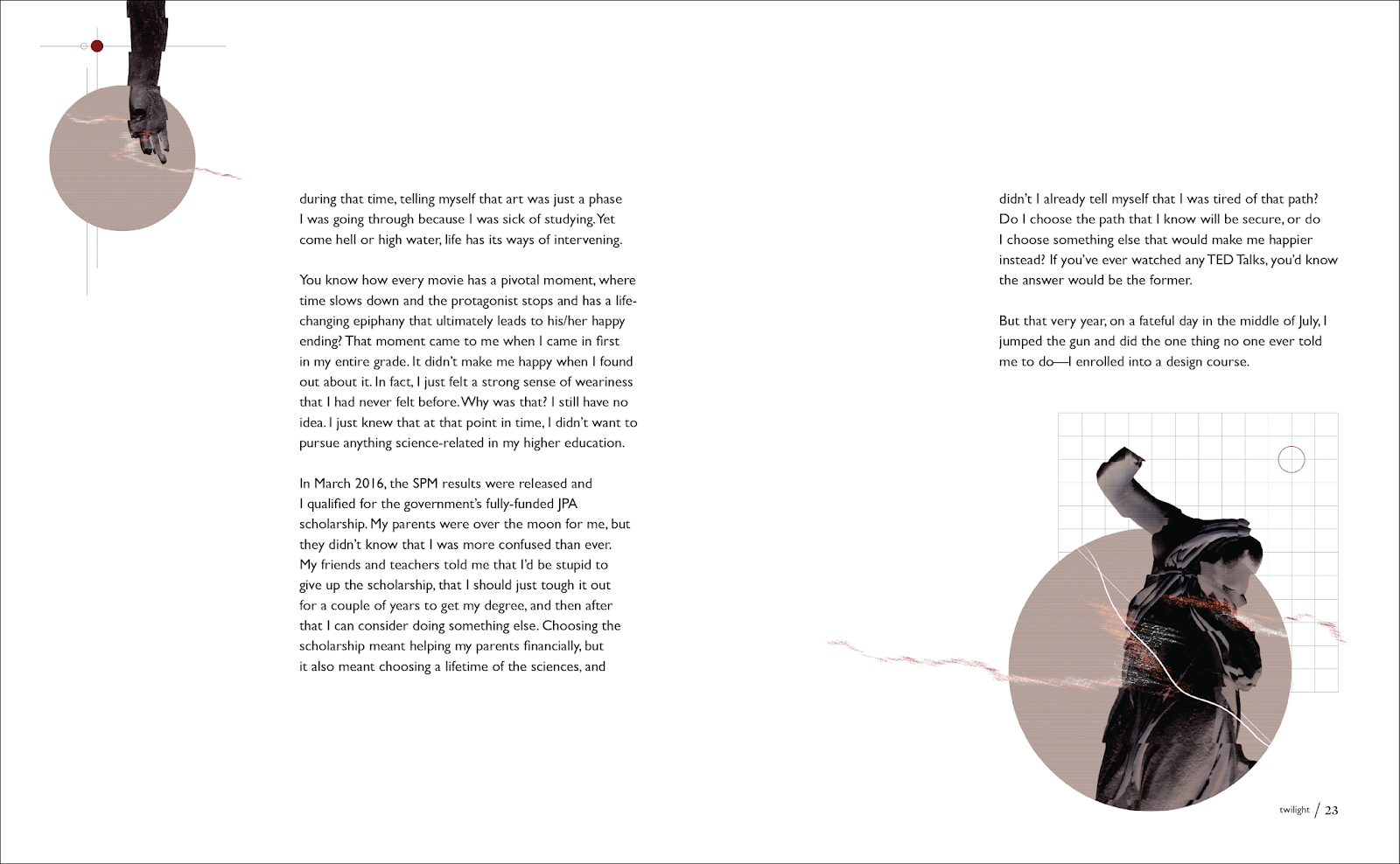
Week 10 (Submission)
 |
| Fig. 5.1: Final layout. |
Spreads
 |
| Fig. 5.2: Spread (1). |
 |
| Fig. 5.3: Spread (2). |
 |
| Fig. 5.4: Spread (3). |
 |
| Fig. 5.5: Spread (4). |
 |
| Fig. 5.6: Spread (5). |
 |
| Fig. 5.7: Spread (6). |
 |
| Fig. 5.8: Spread (7). |
 |
| Fig. 5.9: Spread (8). |
 |
| Fig. 5.10: Spread (9). |
Mock-up
 |
| Fig. 5.11: Final mock-up (folder). |
 |
| Fig. 5.12: Final mock-up (folder). |
 |
| Fig. 5.13: Final mock-up (front cover). |
 |
| Fig. 5.14: Final mock-up (spread). |
 |
| Fig. 5.15: Final mock-up (spread). |
 |
| Fig. 5.16: Final mock-up (spread). |
 |
| Fig. 5.17: Final mock-up (back cover). |
FEEDBACK
Week 6
The overall cleanliness in the layout of the book suits the visuals quite well. Although the layout looks good, it needs to be a little edgier.
Week 7
Eportfolio has not been updated: Exercise, Project 1 should have been completed. Project 2 (on-going) should have been populated with process at 1st page to the end of 1st chapter, type specimen sheet...etc.
Because the new treatment of text is very experimental and modern, the classical drop caps don't seem to work anymore. For the intro page, add something to fill up the empty space in the right corner. The layout is okay, but figure out how to make the visuals fill the space more.
Week 8
The layout of the book is finalized, just remember to add the page numbers later. Begin working on the iPad version of the book, the animations and the front cover.
Week 9
The physical book is good to go. As for the folder, only do it after measuring the actual printed copy of the book. The e-book and animations are okay so far, just need to add some rollover effects for the buttons.
Throughout this entire project, I felt that it took me quite a while to gain momentum and finally produce something decent. I struggled with the visuals as, like Mr Vinod said, they were too graphic and minimal. Because of that, they lacked the kind of impact that full page illustrations or photos tend to have.
Observation
I notice that I tend to stick within the grid a little too much, which made my layouts very rigid and predictable. I guess it's one aspect that I need to work on more. Compared to the first project, I think my time management skills improved, but I still find myself overwhelmed with work from time to time.
Findings
Although each design begins with a fixed grid, it takes creativity to produce interesting layouts throughout the entire book. It is also important to know when to follow the grid, and when to break it. From looking at my classmates' works, I also found that the visuals greatly influence how the layout is designed, and the choice of typefaces used as well.
Layout is the arrangement of the elements of a design in relation to the space that they occupy and in accordance with an overall aesthetic scheme. This could also be called the management of form and space. The primary objective of layout is to present those visual and textual elements that are to be communicated in a manner that enables the reader to receive them with the minimum effort. With good layout a reader can be navigated through quite complex information, in both print and electronic media. Similarly, creative layouts can add value and embellishment to a piece, whereas understated layout can allow the content to shine through.
Layout also addresses the practical and aesthetic considerations of the job in hand, such as where and how content will be viewed regardless of whether the final format is a magazine, website, television graphic or piece of packaging design. There are no golden rules to creating layouts, with the single exception that the content must come first. For example as a guide book communicates its content in a very different manner to that of a thesaurus - layouts are no transferable per se. As such, it is important for us as designers to know how to approach and handle different types of information in different formats.
Week 7
Eportfolio has not been updated: Exercise, Project 1 should have been completed. Project 2 (on-going) should have been populated with process at 1st page to the end of 1st chapter, type specimen sheet...etc.
Because the new treatment of text is very experimental and modern, the classical drop caps don't seem to work anymore. For the intro page, add something to fill up the empty space in the right corner. The layout is okay, but figure out how to make the visuals fill the space more.
Week 8
The layout of the book is finalized, just remember to add the page numbers later. Begin working on the iPad version of the book, the animations and the front cover.
Week 9
The physical book is good to go. As for the folder, only do it after measuring the actual printed copy of the book. The e-book and animations are okay so far, just need to add some rollover effects for the buttons.
REFLECTION
ExperienceThroughout this entire project, I felt that it took me quite a while to gain momentum and finally produce something decent. I struggled with the visuals as, like Mr Vinod said, they were too graphic and minimal. Because of that, they lacked the kind of impact that full page illustrations or photos tend to have.
Observation
I notice that I tend to stick within the grid a little too much, which made my layouts very rigid and predictable. I guess it's one aspect that I need to work on more. Compared to the first project, I think my time management skills improved, but I still find myself overwhelmed with work from time to time.
Findings
Although each design begins with a fixed grid, it takes creativity to produce interesting layouts throughout the entire book. It is also important to know when to follow the grid, and when to break it. From looking at my classmates' works, I also found that the visuals greatly influence how the layout is designed, and the choice of typefaces used as well.
FURTHER READING
Layout by Gavin Ambrose and Paul Harris
5/10/18 - 19/10/18 (Week 6 - Week 8)
 |
| Fig. 6.1: Layout. |
Layout is the arrangement of the elements of a design in relation to the space that they occupy and in accordance with an overall aesthetic scheme. This could also be called the management of form and space. The primary objective of layout is to present those visual and textual elements that are to be communicated in a manner that enables the reader to receive them with the minimum effort. With good layout a reader can be navigated through quite complex information, in both print and electronic media. Similarly, creative layouts can add value and embellishment to a piece, whereas understated layout can allow the content to shine through.
Layout also addresses the practical and aesthetic considerations of the job in hand, such as where and how content will be viewed regardless of whether the final format is a magazine, website, television graphic or piece of packaging design. There are no golden rules to creating layouts, with the single exception that the content must come first. For example as a guide book communicates its content in a very different manner to that of a thesaurus - layouts are no transferable per se. As such, it is important for us as designers to know how to approach and handle different types of information in different formats.
The Layout Book by Gavin Ambrose and Paul Harris
19/10/18 - 2/11/18 (Week 8 - Week 10)
How an object is placed on a page has a dramatic impact on how it is received and interpreted by the viewer, and the message that it delivers. Object placement helps form the narrative of a design and is constructed from an understanding of how we read a page. The narrative of a design can be created and altered by a wide range of placement and intervention strategies as listed below:
 |
| Fig. 6.2: The Layout Book. |
How an object is placed on a page has a dramatic impact on how it is received and interpreted by the viewer, and the message that it delivers. Object placement helps form the narrative of a design and is constructed from an understanding of how we read a page. The narrative of a design can be created and altered by a wide range of placement and intervention strategies as listed below:
- White Space: The empty, unprinted and unused space that surrounds the graphic elements in a design to give them breathing space.
- Balance: The concept of visual equilibrium in a design and the reconciliation of opposing forces in a composition in order to arrive at stability.
- Juxtaposition: The placement of images side by side to create a relationship between them.
- Alignment: The position of type within a text block in both the vertical and horizontal planes, which facilitates its positioning to harmonize with other elements in a layout.
- Broadside: Text rotated 90 degrees to the spine to read vertically.
- Leading and Fonts: Fonts are the characters themselves, while leading is a device used to space lines of text.
- Hyphenation and Justification: Hyphenation, together with word spacing, is a means of controlling a justified text block. Justification can allow the development of rivers of white space in a text block as words are forced to both the left and right margins.
- Indentation: An indent or indentation is the insertion of a variable length space at the start of a text block that is used to give a clear, unambiguous starting point to a text passage.
- Hierarchy: A logical and visual way to express the relative importance of different text elements by providing a visual guide to their organisation.
- Layers: The positioning and overlaying of elements within a layout to add depth to a design.
- Colour: The density of elements on a page rather that their specific colours.
- Texture: Can be added to a design in several ways, such as stock selection, printing methods and by layering colour to create textural depth.
- Pace: It is often desirable for printed material to have a certain pace so that the reader can comfortably progress through it.
- Picture Boxes: The spaces created in a layout for the placement of pictures.
- Passepartout: The borders or white space around the outside edge of a page or design element.
- Gutter: The central alleyway where two pages meet at the spine, although the term also refers to the space between text columns and the fore-edge of a page.

Comments
Post a Comment