15/4/19 - 14/5/19 (Week 3 - Week 7)
Seoh Yi Zhen (0328497)
Packaging & Merchandising Design
Project 1: Paper Bag, Book Sleeve Design
INSTRUCTIONS
Project 1: Paper Bag, Book Sleeve Design (20%)
The Brief
Students are required to design a paper bag, book sleeve and one other item of your choice for book design in Publishing Module. The design must reflect the book design. The design should have the same design language of the book cover/layout.
Project Timeline
Week 3: Bring sample of paper bag, book sleeve and other item in class.
Week 4: Bring in 10 sketches of your concept and suggest new material for the packaging.
Week 5: Make actual 3 dimensional comps that take into consideration each side of the product to finalize your design.
Week 6: Submit your assignment. You have to professionally photograph the final product as evidence for TDS website.
Objective
1. To develop students sensitivity to typography, grid and layout.
2. To develop students understanding of the hierarchy of information.
3. To develop students ability to communicate visually.
Learning Outcome
Learning outcome of the exercise is about convincing a consumer to buy into an idea. You will be also introduced to the concept of the target audience and will be asked to consider a relevant target audience for their product when coming up with their ideas.
PROJECT 1
Week 3
This week, Mr Shamsul briefed us on our first project, which is to design a paper bag, book sleeve and one other merchandise of our choice based on the book we designed last semester. We were told to begin sketching out some ideas, but I didn't manage to do it during our class period.
Week 4
For my paper bag design, I wanted to design a box with a handle instead of a regular paper bag. This was because I didn't like the idea of my book shaking around loosely in a bag. Instead, I wanted the book to fit in a tray so that the overall look would be neater and more presentable. As for the merchandise, I decided to choose a CD audio book. Because my book is kind of like memoir of my life, I figured an audio book which served as another form of storytelling as well as a memento would be appropriate. Below are some of the sketches that I did.
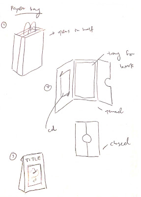 |
| Fig. 1.1: Paper bag sketches. |
 |
| Fig. 1.2: Paper bag and CD cover sketches. |
 |
| Fig. 1.3: Packaging measurements. |
Mr Shamsul gave me the go ahead, so I proceeded to create some physical mockups in order to get the dielines right.
Week 5
For this week's class, I created a mockup that kind of failed because the box cover couldn't open 180 degrees. Mr Shamsul advised me to separate the pieces of the main box and the lid so that it could swing open fully.
 |
| Fig. 2.1: First mockup (1). |
 |
| Fig. 2.2: First mockup (2). |
Week 6
Based on Mr Shamsul's feedback, I created a new mockup. Although the lid was able to open fully this time, the paper wrapping was messy because of the design of the dieline. The measurements were also slightly too small, which caused the inner tray to be bent in order to fit into the box. Besides that, I also created mockups for the CD cover and the book sleeve, but I somehow messed up the measurements for the book sleeve.
 |
| Fig. 3.1: Second mockup (1). |
 |
| Fig. 3.2: Second mockup (2). |
 |
| Fig. 3.3: CD cover mockup. |
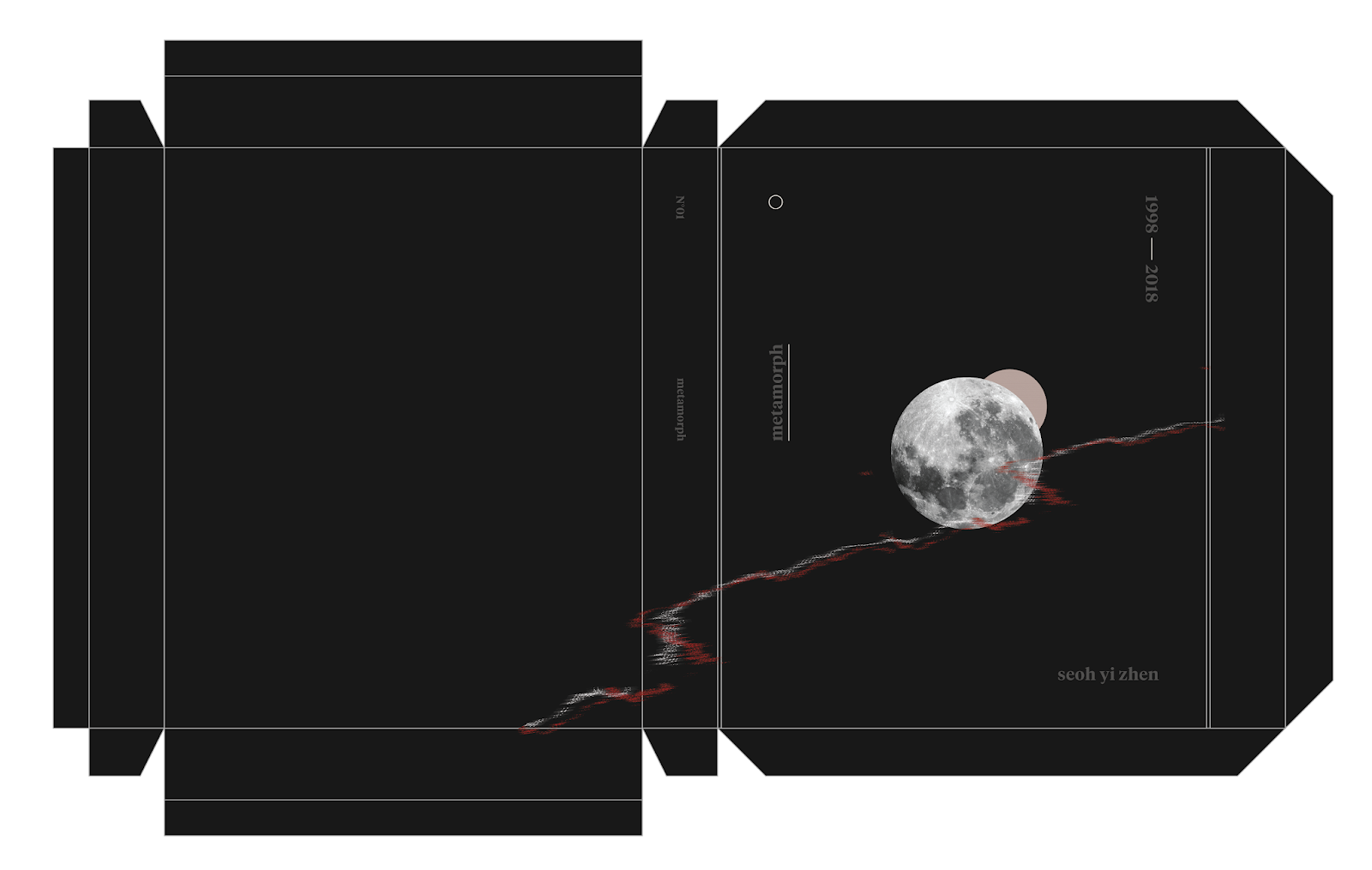
By this week, I also began working on the design of the packaging. The concept of my design is based on the book title "Metamorph", which refers to a process of change. Hence, I wanted the CD packaging and book sleeve to show the changing phases of the moon, a visual that was heavily featured in my book. The CD design for example, would show the moon phases when the CD is spun in its case. The book sleeve also shows a crescent moon when it is closed, but reveals a full moon when the sleeve is fully opened. When I showed my initial designs to Mr Shamsul, he said that it was good and that I should just stick with it.
 |
| Fig. 3.4: Book sleeve design. |
 |
| Fig. 3.5: CD cover design. |
Week 7
I created another mockup in order to fix the issue of the messy wrapping. This time, it turned out okay, and all I needed to do is add the ribbon and magnet closure in the final mockup. Once the dieline was finalized, I finished up the packaging design so that everything could be printed and laser cut.
 |
| Fig. 4.1: Third mockup (1). |
 |
| Fig. 4.2: Third mockup (2). |
Final Submission
Dielines
 |
| Fig. 5.1: Paper bag design. |
 |
| Fig. 5.2: Book sleeve design. |
 |
| Fig. 5.3: CD and CD cover design. |
Mockups
 |
| Fig. 5.4: Paper bag (1). |
 |
| Fig. 5.5: Paper bag (2). |
 |
| Fig. 5.6: Paper bag (3). |
 |
| Fig. 5.7: Paper bag with book and CD (1). |
 |
| Fig. 5.8: Paper bag with book and CD (2). |
 |
| Fig. 5.9: Book sleeve (1). |
 |
| Fig. 5.10: Book sleeve (2). |
 |
| Fig. 5.11: Book sleeve (3). |
 |
| Fig. 5.12: Book sleeve (4). |
 |
| Fig. 5.13: Audio book CD (1). |
 |
| Fig. 5.14: Audio book CD (2). |
 |
| Fig. 5.15: Audio book CD (3). |
Although I think the final outcome looks okay, there are still some issues that I wish I could've resolved. For example, the magnets that were used for the box closure are not strong enough, which is why the box cannot be closed properly. I also wanted the CD to be able to spin easily, so that the changing phases of the moon can be seen through the cutout. However, the CD case itself is a little too tight for the CD to spin inside it. If given more time, I would want to fix these mistakes so that the final outcome can be better.
FEEDBACK
Week 4
The sketches look okay. The choice of merchandise also seems appropriate. Proceed to create physical mockups.
Week 5
The pieces of the main box and the lid should be separated so that the cover can swing open fully.
Week 6
The paper bag mockup looks much better than the previous one. However, a piece of paper should line the inside of the box in order to create a neater appearance. For the CD cover, a circle should be placed in the center so that the CD can spin around easier. The design of the book sleeve and CD cover looks good so far.
Week 7
The printing quality of the CD cover and book sleeve is not as nice as the paper bag. Try printing it on another material and see how it turns out.
REFLECTION
Experience
I'm not sure if it's just me, but this project was really challenging because there are so many components within this one brief. Even though I tried really hard to perfect the dielines, the final outcome still had multiple mistakes. I think it's a bit too late for regrets or what-ifs, but I'll definitely learn from these mistakes in order to create a packaging that is even better for the next project.
Observation
From this project, I noticed that I'm actually a lot more careless than I thought. When I was making the initial mockups, there were a few measurement errors that could've been avoided if I paid more attention. However on a more positive note, I also noticed that my sensitivity towards design is improving because I managed to finish the packaging design within a really short period of time.
Findings
Although consistency in design is key, it's okay to have variations because it makes the overall look less boring and rigid. Besides that, choosing the right materials is really important when it comes to packaging design. This is to avoid any cracks in the ink when the packaging is folded or creased. The finishing of the materials will also affect the look and feel of the final output.


Comments
Post a Comment